
Now, contact paper isn't in any way a decent substitute for using photo emulsion on a screen. If anything, playing around with contact paper cut into a stencil today reminded me of all the positives behind printing with an emulsified screen despite the tedious process involved in getting your screen coated, dried, and your image burnt into the emulsion correctly.
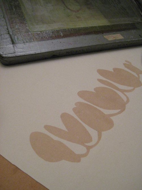
For one, the contact paper does not hold up to moisture well. You can't wash one color of ink off of your screen after you are finished with it, because the stencil would just fall off - so you need to carefully blot it with a rag to tidy it up as best you can before pulling another print or changing ink colors. It is also difficult to keep the bottom of the screen (the part that touches your fabric/paper) clean from excess ink which can result in marks from stray deposits of ink getting onto parts of your work where you don't want it. You can probably get 10-12 one color prints out of your effort - and some of those may not even look decent... (I knew this... I just forgot somehow).
But, I was feeling impatient, and I wanted to print! So, I cut a simple shape out of the contact paper, stuck it to my screen and began printing!
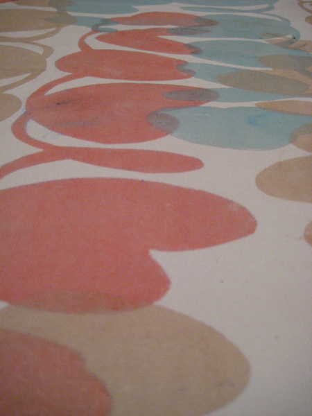
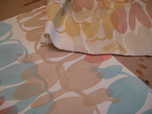
I use a water based inks which I really love because they are translucent, so when you layer colors you get a really nice effect - it's a little bit like mixing color by layering. They are also biodegradable and don't contain any nasty chemicals or plastic like some of the other inks used for printing on textiles that are currently on the market.
I didn't get the best quality prints that I would have liked, but I am happy with how my experiments with the colors I mixed up turned out. I want to try and get together a few color ways that I can reach for when I am looking to print a design. Right now all of my color inspiration is coming from looking forward to warm, crisp weather. I want to call the salmon/taupe/azure color way "summerscape" or something there-abouts. I forgot how much fun it was to play with color because I haven't done it for so long! Amazing!
Today was such a great day. Sometimes just having ten hours free to work on creative projects is all it takes to really get on a roll. It really makes me nostalgic for the days back in school when I would wake at seven and work on art until I went to bed at night. What a life! I would love to be able to fill my days with creativity again... and that is exactly what I intend on doing. Someday. Hopefully soon!
I have been listening to Pandora while writing this post, and the most perfect song just came on... "This Must be the Place (Naive Melody)" by the Talking Heads. I'll leave you with that. Enjoy!

Beautiful colours you've printed! I'm curious about your inks - biodegradable inks sound great.
ReplyDeleteThank you! I am using a clear extender base with textile pigments that I mix in to get whatever color I am going for. They also sell an opaque base if you want less transparency in your inks.
ReplyDeleteYou can order a extender base, along with all of the pigments you may need to mix color, at Pro Chemical and Dye. They do ship internationally if you can't find anyone in South Africa selling a similar product!
http://www.prochemicalanddye.com/store/home.php?cat=317&sort=orderby&sort_direction=0&page=1